Estância do Cervo Brand Identity
As the lead designer for this project, I developed the visual identity for Estância do Cervo, a brand deeply rooted in family heritage and rural tradition. The challenge was to translate this countryside universe into a contemporary visual language — honoring its legacy while embracing elegance and sophistication.
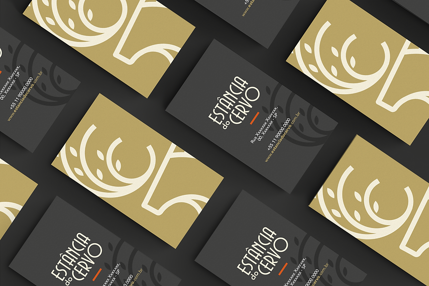
The logotype combines straight and curved lines in a typography inspired by classic farm aesthetics, balancing rustic charm with modern refinement. The symbol was designed with clean, minimal lines, offering a sense of organic simplicity and visual lightness.
The primary color palette sets the tone for the brand’s identity, ensuring consistency and authenticity.
The brand symbol is composed of three key elements: the deer, the tree, and the fingerprint, each representing ancestry, nature, and identity. Its line style was inspired by the original emblem used on the family’s farm, creating a meaningful connection with the past and reinforcing the brand’s storytelling.
The identity was designed to be modular and flexible. The symbol can be used independently as a supporting graphic element, and even when reduced to just the deer’s antlers/branches, it remains distinctive and recognizable. This adaptability allows the brand to express itself across various formats with clarity and personality.
Copyright 2024 by Júlia Nardin
Images, Júlia Nardin
Editing and Publishing, Júlia Nardin
Design and Layout, Júlia Nardin
COPYRIGHT All rights reserved. No part of this publication may be copied, reproduced, assigned, or shared in any form without the prior written consent of Júlia Nardin